Friday, January 14, 2011

May & JUNE

Hello, I am Ashwaan and my months are May & June,

MAY
------

I only used 2 pictures and the template which all of us decided to use as the calender's face. So this is the pictures and the template:-

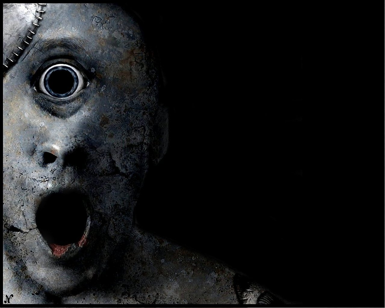
My plan was to get a picture with a the head of a freaky person and a compilation of different characters of well known series

<As you can see I was lucky to get this picture as it had everything I wanted it to have. So without doubting it I went with it


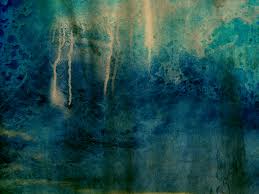
 Alright, the template was discussed for along time, we wanted something

that represents the whole calender and blends with it at the same time, I gave an idea of a cage which on second thought was dumb as it did not mix with others, but this one perfectly matched with everything

Actually, this is a remodeled version of Raymond's old wanted poster theme thing, but this had no wanted poster effect to it what so ever making it blend with anything KRAZY ;)

SO, here is my character


 She or He (I have no idea =P) is like a devil's servant in hell (I think), and her eyes caught me, It was so cold that I wanted to use her.

So I set on my computer as usual to experiment, Let me tell something about myself. I think more than I do my work, I might think about my work for weeks while people try to work for the same amount of days. I come up with ideas doing this easily. So fellow classmates, don't think about ideas when you don't talk. (Walking, Jogging, Playing, Laughing) Anything.

*TIP- Make sure you always have a small notebook that can fit in t you pockets and write the ideas you get, I used to do that but I got lazy =P


SO I MASKED EVERYTHING, AND THIS IS HOW I DID IT


AND I DID THE SAME WITH THE OTHER PICTURE AND TEMPLATE AND EXPERIMENTED MYSELF ON A GOOD COMPOSITION


BUT, I FELT LIKE IT MISSED SOMETHING IN THOSE AREAS, SO I TOOK THE BACKGROUND PICTURE IN TO A NEW FILE AND CROPPED SOME CHARACTERS BROUGHT THEM BACK INTO THE MAIN FILE AND MASKED THEM HOW I DID WITH THE OTHERS. REMEMBER PLAY WITH THE LAYERS TO GET THE RIGHT MASKING TECHNIQUE YOU WANT.


REMEMBER FOLKS, this is how the crop tool looks like, I don't know the shortcut to it (never have been a keyboard guy even though its easy), but this helps you to cut in a hurried manner, Well I wasn't hurrying I just felt it didn't need to be cut neat as I was going to mask it like the others so there you go

THIS IS MY
FINAL PIECE


JUNE
------
PICTURES

Here is my lovely zombie, doesn't she look pretty =)
I am such a video (Guy reading this ROLES EYES)
hehe, anyways I say something in her eyes saying DUHHHH
like a zombie so I had to take her


AND THAT'S MY REASON TO PICK HER.


Felt like hands were necessary to make it more awesome
On my first attempt I did not use hands, but on final work I decided to put it in


IT WORKS GREAT


Like the last one I had to use these guys, It looked awesome when I do that masking thing.

SO I CONSULTED WITH MY LEADER AND HE SAID THE GUYS WERE TOO BIG AND I NEEDED TO MAKE THEM SMALL SO THIS IS WHAT I DID


 After that I put in the template and Zombie in and inserted the hands on top of the template where as I masked the template vanishing it to make the people appear like my May work. And also I gave the zombie some britghness changes and gave the hands some shadow changes


AND WALLA, THE FINAL WORK


CONCLUSION

-----------------

I used only masking and nothing special except to give shadows to the June's Hands and Played with the brightness of the zombie.

You can ask me any questions if I wasn't clear enough for you =).

Thank you for reading and hope you liked it.

Thursday, January 13, 2011

March & April

MARCH

After a few drafts made, the group has decided to put the calendar template on the right side. While the picture is a little smaller then the calendar.
Original picture
I choose werewolf as my subject.
Template
This is the march template after editing the original template.
Place side by side
And then i put them side by side.
Texture as overlay
And then i add this texture as overlay. I use many type of brushes over the picture. Stamp clone tool is used to cover the typography on the original picture. For the eye, i brush as quick mask and change its hue/ saturation.
I used quick mask on the werewolf face and use filter dust and scratches. And it turn out like this!
Final March


APRIL

Original picture
I use chucky as the April subject.
April template
This is the template for April after i edit the original template.

First i open new A4 size file, paint it black.
Place side by side
And then i place the picture and template side by side.
I place the chucky picture on the chucky original picture (the same picture) again as overlay to make it darker.
Texture
I use this texture as overlay to make it blend together. And again i use brushes on the picture or its vector mask to blend the picture and template together. And to cover the typography, i brush it with black, so it blend with the background.

Final April

_________________________________________________________
draft (less dark and have not improvised)
draft (what i have in mind)
draft using the template the group decided


NUR RAHMATUL SOLEHAH BINTI RAHMAT
1102702492


RAYMOND: SEPTEMBER AND OCTOBER

SEPTEMBER:

i decided to use the character from scream for september...mostly because it really seemed like we had been neglecting him and so i thought to myself,a horror calendar without "the scream guy",isn't a horror calendar!!!

PROCESS:

1.First i searched through google for a good enough image of the scream guy and decided to go with this one:


You can tell at this point i was pretty excited...i mean he looked scary enough already!!!

I also needed a an image that i would be using as my additional design to blend the template in with my character.

The scream guy has a habit of using sharp objects,knives,daggers and sickles to "do the necessary" to his victims.I chose a sickle image to use coz it seemed most fitting to get my point across...my Horror point that is....hehehe


2.I placed the pictures in photoshop on an A4 sized canvas with a black background.and imported the date template and corrected the dates as necessary.

I had to resize the image a little to fit it the document.
By using masking on the template group layer,i was able to make the scream guy appear like he was infront of the template.


I didn't have many public holidays in this month but atleast i got "hari malaysia" in there.

3.using the selection tool i deleted the background around the sickle.

i also added a drop shadow and inner shadow to give it a more scary look in my opinion

Then using several duplicates of the sickle,i rotated and and placed the around the date template,i used masking where necessary in order to make some of the parts of the  sickles appear behind or in front of the template.


4.Finally i decided to add some contrast and hue saturation to the scraem guy inorder to give him a little more life....or death hehehe.


AND THAT'S IT FOR SEPTEMBER NOW FOR OCTOBER....

OCTOBER

So with September out of the way,i headed to october...i decided that i would use a "cyclops" as my character for this month!!! don't know what a cyclops is ???...


BAM!!

Guess that got you by surpise!!!freaked you out right....thats exactly what i was aiming for...this image of a cyclops suits my intentions completely...keeping the theme of our calendar going, we need every month as shocking as we can and so OCTOBER!!!

PROCESS:

1.I placed the image in photoshop along with the date template.


2.Now for the design connecting the character and the date template.
(Prepared in a seperate document)
I used 2 images to create this effect:
(torn paper)

(mud cracks)

>First i had to remove the white from the middle of the torn paper image.I used the quick selection tool,to select the part and i deleted it.this created a hole through the paper


>Then placed the mud crack image layer above the torn paper and created a clipping mask on the mud crack layer...it gave me this result:


>I then desaturated the mud crack layer clip to give the image a black and white look that would be closer to the cyclops' skin look...


border

>Using a curves adjustment layer,i reduced the brightness of the border and adjusted the green,red and blue curves a little until the border matched the cylops skin.


comparing the border and the cyclops


3.  I placed the border in the october document(had to merge the border layers to make them easier to work with)

I rotated the border to make it portrait and placed it on top of the date template.


4.I then added a mask to the border layer and to hide bits of  it and also to join the cyclops to the border(join the toghether).
I also a layer above between the template and the border to create a sense of depth in the image


showing the different layers

5. Finally,here's October!!! oh and ofcourse take note that i didn't forget to give credit to Halloween!!!


THE MONTHS OF NOVEMBER AND DECEMBER!!

NOVEMBER

I used the great Freddy Kruger an amazing character with impressive images. but i chose this one ..(above)
i already had a way of connecting my calender template to the image in the background. i wanted to make it look like he was holding the calender. so step one was to stretch his sharp metallic fingers.

 after stretching the the metallic fingers i then had to find a way of realistically making the fingers hold the template so i came up with the idea of making a screw hole through the calender with the idea that Freddy's fingers go through. so i got an image of a screw hole and duplicated it used a little bit of my composting techniques, some masking,blend modes and  i had that in check. below are the images of the screw hole image.


now the dates and day template.,


this template was one of the most challenging achievements, we agreed to have a different template from each group member so we can see which would appear better. it is amazing how everyone came up with a really brilliant idea but unfortunately not ll could be used and to be honest i don't even know the criteria we used to chose this one!! below is the template image.


the template was made by our leader and distributed as a psd file so all we had to do was replace the dates with those that suited our months. so i did exactly that and then took on my challenge of blending the image with the template, i must say i tried a whole lot of sleepless nights, no kidding!! below is an image of my first attempt to compost all these images to come up with a calender looking like result..


i tilted the template a little bit and  then blended the screw holes in the sides for Freddy's fingers to got through. i added a chisel hard bevel on the texture in the template to create that sort of hard edge on the template. (i also added a  a torn edge brush to create some kind of uncommon effect but we had to drop it and make something uniform) see below!!


we finally came up with a specific size for the template and a specific way for it to look. it was to stand straight and we had to make it look like the background and the template are together!! by now its clear we haven't tackled the year, we also found a place for it at the bottom of the template and reduced its opacity,so i came up with this result,,


it was not that bad, but i then came up with a boarder to just have a simple horror like effect using Freddy's finger gloves,, and i just had to stop there because i was about to start spoiling the work!!hahaha i was happy about it being a first time photoshop user. and finally this is what i came up with,,


                                   and that is what i handed in for the month of November!!


                                          DECEMBER
i must say i had a zillion ideas for December that con and could have possibly clouded my judgment and this is funny but what i used for consultation is not what i used finally. but fine this is what i did finally. my final image from the movie Texas chainsaw massacre.


i flipped the image horizontally to create uniformity since all the months where supposed to have the image on the left. not a lot was done to the image itself except of course a few color corrections here and there for it seemed just perfect for idea!!


i straight away replaced the dates in the template and i was all set to work on making the magic happen. the general steps were much simpler since i had already been through them in the November month.  now i am going to explain the few dramatic things i put to make a rather dramatic month. first, i had them both on on one a4 size page,,


after having them together, it was now time to add some drama, i got a roots image to connect it to the trees in the back ground and make it look like the the month template is behind them, here is the image i used.


i masked in very carefully and although i did not exactly get the best roots for the effect, at least these tried to work..  here is what i made out out them,,,


a protruding root from behind the template. and it was really looking good to me... so to even make it more appealing i added another set of roots which appeared below and above the template, as shown in the image below,


so i added the roots at the bottom and it really added some depth into the appearance of the template!! but finally i also did the same at the top and the effect was evenly distributed around the whole composition. i also added a lens flare right next to the template on the left to depict a sunset and everything in the end came out just like this....


           and that is what i came up with!!!
                PETER NIWAGABA