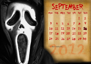
i decided to use the character from scream for september...mostly because it really seemed like we had been neglecting him and so i thought to myself,a horror calendar without "the scream guy",isn't a horror calendar!!!
PROCESS:
1.First i searched through google for a good enough image of the scream guy and decided to go with this one:
You can tell at this point i was pretty excited...i mean he looked scary enough already!!!
I also needed a an image that i would be using as my additional design to blend the template in with my character.
The scream guy has a habit of using sharp objects,knives,daggers and sickles to "do the necessary" to his victims.I chose a sickle image to use coz it seemed most fitting to get my point across...my Horror point that is....hehehe
2.I placed the pictures in photoshop on an A4 sized canvas with a black background.and imported the date template and corrected the dates as necessary.
I had to resize the image a little to fit it the document.
By using masking on the template group layer,i was able to make the scream guy appear like he was infront of the template.

I didn't have many public holidays in this month but atleast i got "hari malaysia" in there.
3.using the selection tool i deleted the background around the sickle.
i also added a drop shadow and inner shadow to give it a more scary look in my opinion
Then using several duplicates of the sickle,i rotated and and placed the around the date template,i used masking where necessary in order to make some of the parts of the sickles appear behind or in front of the template.
4.Finally i decided to add some contrast and hue saturation to the scraem guy inorder to give him a little more life....or death hehehe.
AND THAT'S IT FOR SEPTEMBER NOW FOR OCTOBER....
OCTOBER
So with September out of the way,i headed to october...i decided that i would use a "cyclops" as my character for this month!!! don't know what a cyclops is ???...
BAM!!
Guess that got you by surpise!!!freaked you out right....thats exactly what i was aiming for...this image of a cyclops suits my intentions completely...keeping the theme of our calendar going, we need every month as shocking as we can and so OCTOBER!!!
PROCESS:
1.I placed the image in photoshop along with the date template.
2.Now for the design connecting the character and the date template.
(Prepared in a seperate document)
I used 2 images to create this effect:
 |
| (torn paper) |
 |
| (mud cracks) |
>First i had to remove the white from the middle of the torn paper image.I used the quick selection tool,to select the part and i deleted it.this created a hole through the paper
>Then placed the mud crack image layer above the torn paper and created a clipping mask on the mud crack layer...it gave me this result:
>I then desaturated the mud crack layer clip to give the image a black and white look that would be closer to the cyclops' skin look...
 |
| border |
>Using a curves adjustment layer,i reduced the brightness of the border and adjusted the green,red and blue curves a little until the border matched the cylops skin.
 |
| comparing the border and the cyclops |
3. I placed the border in the october document(had to merge the border layers to make them easier to work with)
I rotated the border to make it portrait and placed it on top of the date template.
4.I then added a mask to the border layer and to hide bits of it and also to join the cyclops to the border(join the toghether).
I also a layer above between the template and the border to create a sense of depth in the image
 |
| showing the different layers |
5. Finally,here's October!!! oh and ofcourse take note that i didn't forget to give credit to Halloween!!!


No comments:
Post a Comment